Identifying Different Types of Candlestick Charts
Trading graphs are an essential tool in the technical trader’s toolbox.
They allow traders to perform technical analysis and predict future price-movements by analysing past price-action of a financial instrument. Price-charts are used in almost all financial markets, such as the stock market, Forex market or commodities market.
In this article, we’ll take a closer look at the most popular type of price-charts – Japanese candlestick charts – and show you how to predict candlestick charts using some basic patterns.
- Learn more, take our free course: Japanese Candlesticks Decoded
Main Types of Price-Charts
There are many types of price-charts, such as line charts, bar charts, candlestick charts and Heikin Ashi charts.
While all of them have certain advantages and drawbacks, by far the most widely used type of price-charts are Japanese candlestick charts. In the following lines, we’ll list some of their most important characteristics.
1) Line Charts – Line charts are the most basic type of price-charts. A simple line connects all closing prices of a financial instrument and is then graphically represented in the form of a chart, as shown in the following image.
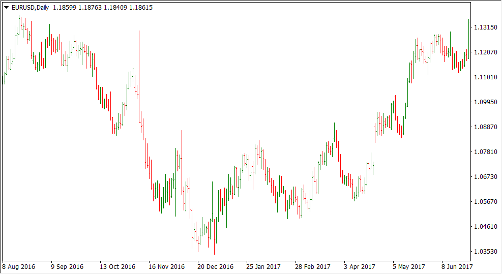
2) Bar Charts – Unlike line charts which represent only the closing prices of a financial instrument, bar charts reflect the opening, high, low and closing prices. This is why bar charts are also called OHLC charts. The high and low prices are shown by a vertical line, while opening and closing prices are shown by the short left and right dashes.
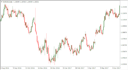
3) Candlestick Charts – Just like bar charts, candlestick charts are OHLC charts which show the opening, high, low and closing prices of a financial instrument. Steve Nison introduced candlestick charts to the Western trading world in his book titled “Japanese Candlestick Charting Techniques”.
They carry the name “Japanese” because of their origin – they were first used by Japanese rice traders in the 19th century.
The opening and closing prices are represented by the solid body of a candlestick, while the high and low prices are shown by the upper and lower wicks (shadows) of a candlestick. A candlestick chart is shown in the following graphic.
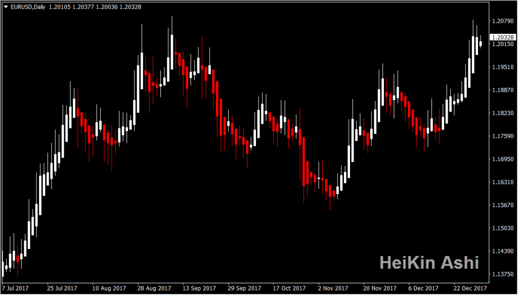
4) Heikin Ashi Charts – These charts are very similar to candlestick charts, with the main difference that the opening and closing prices of Heikin Ashi candles are calculated in a slightly different way.
The opening price of a Heikin Ashi candle is located at the mid-point of the previous candle’s body, while the closing price is the arithmetic average of the opening, high and low prices of the current candle. A Heikin Ashi chart is shown in the following image.
How to Read Candlesticks?
Reading candlestick charts doesn’t differ much from reading bar charts. If you’re already familiar with bar charts, you won’t have many problems switching to candlestick charts.
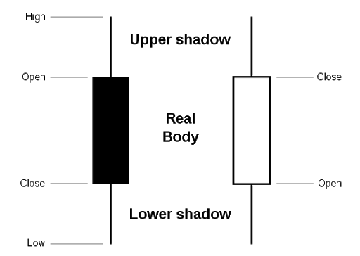
A single candlestick is formed by a solid body, which represents the opening and closing prices for the trading period, and upper and lower candlewicks, which represent the highest and lowest prices reached during the trading period. This is shown in the following image.
In essence, there are two types of candles – bullish and bearish ones.
A bullish candle forms when the closing price is above the opening price (white candle on the graphic above), while a bearish candle forms when the closing price is below the opening price (black candle on the graphic).
However, most modern trading platforms allow you to change the traditional colours of bullish and bearish candles. I like to use green for bullish candles and red for bearish candles, as it adds some colour to the chart and makes it easier to identify bullish and bearish trading days.
Read: Bullish and Bearish Markets Explained
When to Use Candlestick Charts?
Candlestick charts can be used whenever you need a price-chart to make trading decisions. These type of charts is used in all financial markets and on all timeframes, as it provides valuable information about the open, high, low and close prices of a trading session.
In addition, these pieces of information are represented in a graphically appealing format which makes it much easier to identify bullish and bearish trading days and candlestick patterns than with bar charts.
How to Interpret Candlestick Charts?
As you already know, candlestick charts are formed by single candles which provide plenty of information about their trading session.
Long upper wicks, for instance, signal that buyers managed to push the price up to a significant extent before sellers lowered the price below the trading session’s high. Similarly, a long lower wick signals that sellers have pushed the price down before buyers jumped into the market and raised the price above the trading session’s low.
In this regard, candlestick charts reveal a lot of information about the battle between buyers and sellers during a trading period. Many traders rely on candlestick charts to predict future price-movements of a financial instrument by analysing so-called candlestick patterns.
We’ll take a closer look at candlestick patterns in the following lines.
How to Predict Candlestick Charts?
As a type of price-charts, candlestick charts are often used by technical traders to perform technical analysis and predict future price-movements based on past price-action. Technical tools, such as trendlines, support and resistance levels, chart patterns and peak and trough analysis can be successfully performed on candlestick charts and in any financial market.
Besides the mentioned tools, candlestick charts are also often used in combination with candlestick patterns. These patterns form by a single candlestick or a group of candlesticks and are mostly used to confirm an identified trade setup before entering into the trade.
Read:
Easy to Understand Price Action Trading
How to Enter a Price Action Trade
Forex Charting Types Explained
As said, candlestick charts represent the battle between bulls and bears in a graphical way, and the information contained inside a candlestick (open, high, low and close prices, length of a candle’s body, position of the body etc.) can be used to anticipate which side has won and which side will dominate the following trading – buyers or sellers.
Main Candlestick Patterns
There are many different candlestick patterns which go beyond the scope of this article. You can read about all of the major patterns here. If you want to learn more about candlestick patterns and how to trade them, I also highly recommend Steve Nison’s book, Japanese Candlestick Charting Techniques which offers a detailed overview of all candlestick patterns.
View: 9 Day Trading Books You Can’t Do Without
In the following lines, we’ve listed the main candlestick patterns which are widely used by technical traders.
Hammer and Inverted Hammer
A Hammer pattern is a single candlestick pattern which forms at the bottom of a downtrend. It has a long lower wick and a relatively short body. While the colour of the body is not much important, the pattern is slightly more bullish if the closing price is above the opening price.
The long lower wick signals that sellers had the upper hand initially, but buyers managed to push the price near the trading period’s opening price. An Inverted Hammer pattern looks like a regular Hammer pattern turned upside down, forms at the top of an uptrend and signals that the uptrend is about to reverse.
Spinning Top and Bottom
A Spinning Top pattern is a single candlestick pattern that signals indecision in the market. It has long upper and lower shadows and a relatively small real body, signalling that both buyers and sellers managed to push the price above/below the opening price.
The closing price, which is near the trading session’s opening price, signals that both buyers and sellers finished the trading period in equilibrium.
When formed during uptrends, Spinning Tops often signal a trend reversal. If a Spinning Top forms at the bottom of a downtrend, the pattern is called a Spinning Bottom and signals that the downtrend is losing steam and that a trend reversal might be ahead.
- Learn more, take our free course: Reversal Price Patterns
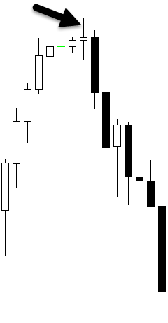
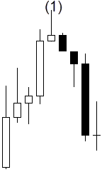
Hanging Man
A Hanging Man pattern (1) is a single candlestick pattern characterised by long lower wicks which are at least twice the size of the candle’s body. A Hanging Man pattern signals that sellers are regaining their power by managing to push the price significantly below the opening price.
Hanging Man patterns pretty much resemble Hammer patterns ((2) on the graphic above), with the only difference that Hanging Man patterns form at the top of uptrends while Hammer patterns form at the bottom of downtrends.
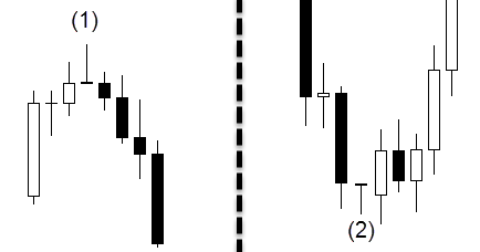
Harami Pattern
A Harami pattern is a candlestick pattern that includes a pair of two candlesticks. The first candlestick of the pattern completely engulfs the second candlestick, including the second candlestick’s upper and lower wicks.
The pattern got its name from the Japanese word “Harami” which means pregnant, as the second candlestick looks like the child of the first candlestick inside the pattern.
A Harami pattern can be bullish or bearish. The chart above shows a bearish Harami pattern that forms during uptrends and signals that a trend reversal might be ahead. A bullish Harami pattern forms during downtrends and consists of a first bearish candlestick which completely engulfs the second bullish candlestick.
Shooting Star
A Shooting Star pattern is a triple candlestick pattern. The first candlestick is a large bullish candlestick, followed by a second candlestick with a small real body and a long upper shadow, after which a bearish candlestick closes below the second candlestick’s close.
In less liquid markets, the candlestick in the middle can open with a gap away from the first candlestick. However, in liquid markets such as Forex, gaps don’t occur that often and the Shooting Star pattern is then valid even without the gap.
Doji Pattern
Last but not least, Doji patterns are a very powerful candlestick pattern that consists of a single candlestick. A Doji doesn’t have a solid body at all, which means that opening and closing prices are exactly the same. The candlestick can have upper and lower wicks.
A Doji pattern usually signals indecision in the market, as neither buyers nor sellers managed to push the price above/below the opening price. This can be quite bearish during uptrends (i.e. buyers are losing steam and sellers are regaining power), and quite bullish during downtrends (i.e. sellers are losing steam and buyers are regaining power).
A typical Doji pattern is shown in the following graphic.
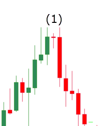
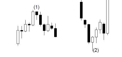
Besides typical Doji patterns which have upper and lower wicks and no real bodies, there also exist so-called Gravestone Dojis and Dragonfly Dojis. A Gravestone Doji is a typical Doji without lower wicks, i.e. the opening and closing prices are located right at the lowest price of the trading period.
On the other side, a Dragonfly Doji comes without upper wicks, i.e. the opening and closing prices are located right at the highest price of the trading period.
Gravestone (1) and Dragonfly (2) Dojis are shown in the following chart.
Final Words
Candlestick charts are a type of OHLC (Open, High, Low, Close) price-charts which can be used in all financial markets and in the trading of all financial instrument. Steve Nison introduced Japanese candlestick charts to the Western trading world three decades ago, making this price-chart one of the most popular and most widely used in the trading community since then.
Candlestick charts consist of single candlesticks which have solid bodies and upper and lower wicks. The solid body of a candlestick represents the opening and closing prices for the trading period, while upper and lower wicks represent the highest and lowest prices reached during the trading period.
Traditionally, bullish candlesticks, i.e. those candles which have opening prices below their closing prices, are white in colour. Bearish candlesticks which have closing prices below their opening prices are represented in black. However, most modern trading platforms let you change the colour of candlesticks with a few clicks.
Candlestick charts have also become popular because of the specific candlestick patterns that can be identified on those charts. Candlestick patterns are patterns of a single candle or a group of candles which describe the battle between buyers and sellers. This way, candlestick patterns are often used to anticipate future price-movements or to confirm a viable trade setup identified with other technical tools.
- Learn more, take our premium course: Trading for Beginners